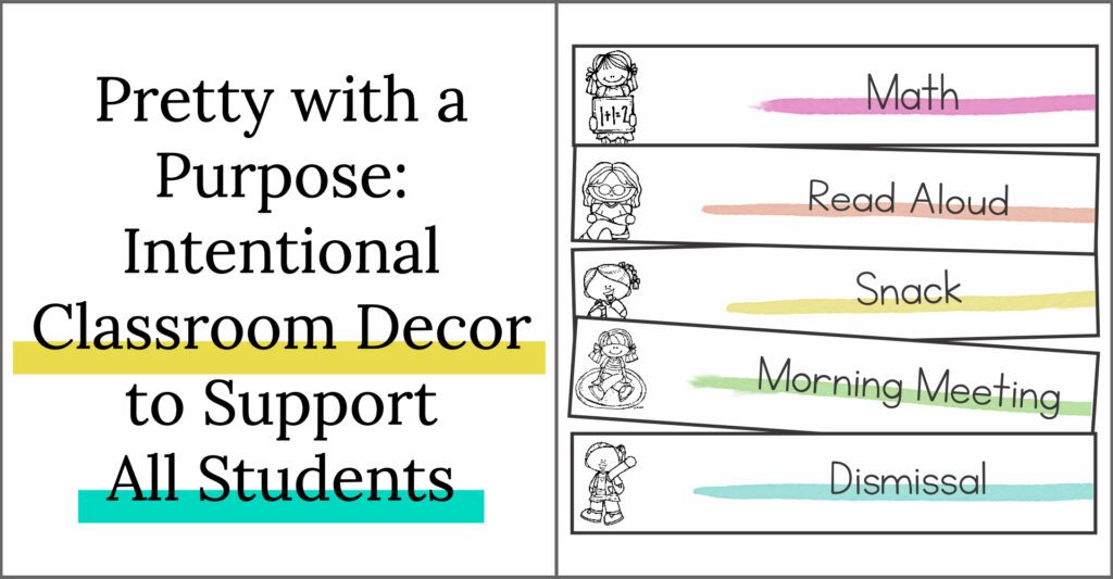
Let’s talk about how we decorate our classrooms and why you should be thinking about intentional classroom decor and design.
It is no secret that I was a kid who struggled with overstimulation, executive functioning, and dyslexia. I would walk into a new classroom each year, noticing that it was full of lovely decorations and posters on the walls, but I felt lost. The walls were exciting and eyecatching, but they weren’t accessible. I needed walls that were designed to help me focus, with text and resources I could understand.
Now is the time of year when we are entering (or re-entering) our classrooms. As teachers, we have the power to transform our physical spaces into dynamic teacher tools. If you’re like me, you get excited to return to your space and enthusiastically have been thinking about all of the ways you’re going to make your classroom feel like a home away from home.
As you’re doing this, it’s time to discuss how you create an inviting classroom that corresponds with a space that benefits (wholeheartedly) your students.
Today, I’ll be writing to you about designing your space with intentional classroom decor as the ultimate teaching tool while still creating a cozy space for students to feel comfortable in. My own student experience mixed with years of rethinking my classroom choices has led me to a motto: Keep it simple. When decorating your classroom:
- Go slow
- Be intentional
- Ask yourself: How does this help?
Let’s dive in!
Easy To Read
Environmental text can be found everywhere in a classroom. Print connected to your students’ surroundings can indirectly help emergent readers learn to recognize letters and words. Classroom decorations often include words on our calendar, schedule, signs, etc. But, not all text is the same.
When it comes to intentional classroom decor and design, three things that turn environmental text into a teaching tool:
- Clean font choices
- Simplified text
- Adjusted font size
Clean Font Choices
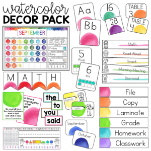
With so many fun font choices out there, it can be hard to decipher which ones are student-friendly. I like to be intentional about picking fonts that are as simple as possible. I look for:
- Straight lines
- Print-style writing (think: examples of what you want their handwriting to look like)
- Consistent line width
- Weighted fonts (thicker line width to emphasize certain parts of a letter)
Watercolor Decor Pack
Simplified Text
Intentional classroom design often comes down to picking and choosing what is essential. That goes down to the very last detail, which explains why I only use essential words and simplify every piece of wall text to its most basic meaning.
Sometimes that means even boiling down a sentence to one word. For example, I have two bins for loose-leaf work. Instead of “Finished work,” my label says “Finished.” The meaning is still there. Students know that if they have completed their assignment, it goes in “finished.” Likewise, my bin for unfinished work is labeled “unfinished.”
Think About Size
This point may seem obvious, but it is also crucial. When you design your classroom with inclusivity in mind; make sure to think about font size. Scope out your room and measure the distance from where the text lives and where you expect students to read it.
There are two reasons for taking a moment to think intentionally about this design element. In an inclusive classroom setting, you don’t want to overwhelm students with too many big fonts. And, you will also have students who have visual impairments (near-sighted) who need environmental text to be strategically and intentionally slightly more prominent than necessary for the average eye. Also, remember that not all wall text needs to be seen from far away. I highly recommend minimizing those fonts to support student focus.
Non-overwhelming Visuals
Awareness of visual stimuli is a vital part of designing an inclusive classroom. It is easy to get excited by a range of visuals. After all, don’t you want students to notice everything in your classroom? I, along with many others, have fallen for this theory.
However, over the years of experience and research, I learned that I had been overloading many of my students. The considerable amount of visual stimuli not only caused decreased focus and heightened alertness in some students throughout the day, but it wasn’t helping to support student independence.
So, I revamped my classroom with students’ mental and visual health in mind by using intentional classroom decor and design. There were three categories that I researched as I redesigned: color, font, and images.
Color
There are two main factors to keep in mind as you assess color in your classroom:
- Color consistency
- Muted tones
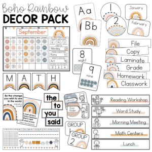
Research suggests that a consistent color palette throughout the classroom is ideal. It limits the range of stimuli while creating a more cohesive look to the space.
Staying consistent with the color palette is tricky. After all, creating resources for the entire classroom that fit one theme takes a LONG time.
Boho Rainbow Decor Pack
Those who have been following me for a while know that I LOVE rainbow. But, I’ve also learned that consistently sticking to bright rainbow colors can be a lot on the eyes. Gentle, less saturated rainbow patterns (such as watercolors) and muted tones are not just a design fad! They aid in creating a soothing, less stimulating environment that is ideal in an inclusive setting.
Font
Font is another important part of my classroom that I realized needed a redo. I LOVE fun fonts. But, it’s necessary to think about how the font benefits our classroom and supports student independence.
Intentional classroom decor and design means choosing a handful of fonts and sticking with them. The benefits of selecting a few fonts go beyond creating a clean, sleek look. The fonts you choose and stick with can support student learning. For example, emergent readers will become more familiar with letter formations over time. Writers will have consistent mentor texts to replicate.
Images
Over the years, I’ve always included pictures to support text. But I’ve learned over and over that simple is better. The most impactful visual supports are those with little detail. Why? Because they are direct, quick to understand, and limit distraction. I aim for images that have just enough detail to show the text it supports. Simple lines and limited colors for my pictures are principal.
Every Visual Has a Purpose
As you get your classroom ready for the first day, you might be excited to turn your classroom into a wonderland of student engagement. Personally, creating a visually appealing and inviting space is one of my favorite parts of the job. However, make sure that as you decide what to put on your precious wall space (there is really never enough), each item has a purpose, AND students are aware of that purpose! This is where intentional classroom decor can help you utilize your wall space to create a beautiful but inclusive space for your students.
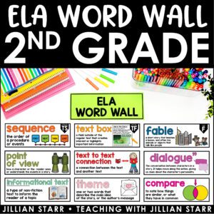
Word Walls
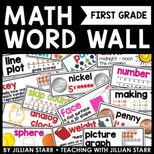
Word walls are incredible visual resources. They can enhance student independence, making your centers and independent work time so much more successful and efficient. But, that is only if your students know how to use it.
This brings me to one of the most impactful changes I’ve made in my classroom to support student independence and classroom ownership: The co-creation of word walls.
Now, I start my year off with a clean slate. Students see a space for a word wall but no words. Once we get started learning important, new vocabulary, I begin introducing words for our word wall.
We model and practice using the word wall as we place our first few words on the wall (we even make it a celebration). As we do, students learn exactly the purpose and how to use it. They know that when new words are added to the word wall, it means they might need to use those words. So, they reference those words as helpful.
Now here’s the thing: Students MUST understand the organizational system. That’s where co-creation comes into play.
We talk about:
- Different methods of organization (i.e., alphabetical or by topic)
- The merits of each kind of organizational system
Our classroom community decides on the organizational system of each word wall. The idea is that we will choose an arrangement that supports how the majority of the student body thinks.
Math Word Wall (Grade 1)
Calendars
Number one teaching tool: a calendar.
The calendar is crucial. First and foremost (in my opinion), calendars are a central part of developing a classroom community. I use them as a grounding routine that sets the tone for each day. Through the morning calendar routine, all students can start fresh and be on the same page.
My morning calendar routine often includes a variety of different activities as well. Want to have more real-life math throughout the day? Use your calendar! A few ways I use my calendar each morning:
- Number Order
- Weather Tracking: Estimate, Graphing, and Measurement
- Count downs
- Tracking days in school
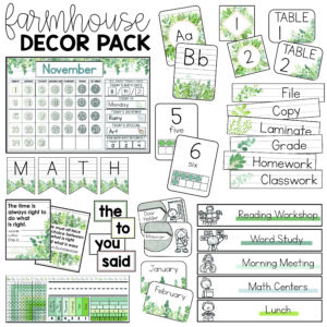
Farmhouse Decor Pack
Schedules
I didn’t fully realize it for many years. My visual schedule was one of the most supportive elements of my classroom for so many of my students.
I came to understand that visual schedules are an important UDL (universal design for learning) element. Over the years, I’ve taught such a broad range of thinkers and personalities—many with IEPs and many without. I’ve even taught some students who have similar learning profiles as my own! Visual schedules aid transitions and keep kids feeling prepared throughout the day. While they are especially powerful for students with ASD (autism spectrum disorder) or those who experience high anxiety, they benefit everyone:
- Students with executive function difficulty
- ASD (Autism spectrum disorder)
- Individuals with high anxiety
- Emerging bilinguals
- Students with reading disabilities
- Non-IEP students who have difficulty with transitions
Why are they so helpful?
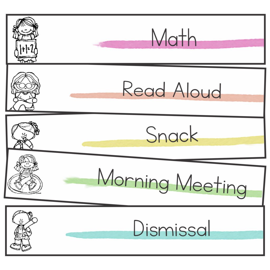
Daily schedules that include subjects and time periods help prepare students for what will happen throughout the day. They alert students of significant changes to how a specific day might normally run or simply keep students in the loop about what will happen next. I can’t even begin to explain to you how many times I’ve seen my students take a moment to independently walk up to the daily schedule and nod as they process it.
Inclusive Calendar Choices
Calendars hold a lot of power as we design inclusive spaces for our students. They are a community-centered feature in the classroom that has endless possibilities for acknowledging student backgrounds.
One goal of mine is to make sure that every holiday my students celebrate is also featured on our calendar.
That’s why I do a family intake. I start to collect information about my students before the school year begins. I send out a “Getting to Know You” form. I ask for information such as:
- Preferred names
- Hopes and goals for each student from their families
- Areas where students benefit from extra support
- Things each child loves
- Family structure
- Family background, including holidays, customs, and important dates for each family
I have developed an extensive calendar collection by listening closely to the traditions celebrated by each one of my students. If I learn a new holiday, I’ll add it in. There is no harm in including more windows into the celebrations of others, even if it isn’t a major holiday in your classroom this year.
Most importantly, I’ve had students light up when a personally important celebration shows up on the calendar. There have been times when they say, “How’d you know about that!” with their eyes sparkling, and you can see that they feel genuinely welcomed through a simple piece of wall text.
I hope these tips have helped you think about how to use intentional classroom decor this back-to-school season. Remember: keep it simple. And, when in doubt, ask the kids for help! I’d love to see your classrooms and hear about additional ways in which you’ve transformed your space into an inclusive one.

Leave a Comment